Look at the light first
The single biggest influence on how a colour looks is the light in the room. In the UK, north-facing rooms get cool, bluish light all day, which can make greys look cold and whites look flat. South-facing rooms are bathed in warm light that brightens almost anything. East-facing rooms are bright in the morning and dim later; west-facing rooms are the opposite.
So before falling for a shade online, think about when you actually use the room. A colour that looks perfect on a sunny Saturday afternoon may feel gloomy on a dark Tuesday evening in November.
- North-facing: warmer neutrals, soft yellows and earthy colours tend to work well
- South-facing: cooler blues, greens and greys hold up nicely
- East-facing: colours that look good in morning light and under lamps
- West-facing: warm evening light flatters most colours
Test properly – on the wall, not the chart
Tiny chips on a colour card are almost useless for judging a whole wall. Buy sample pots, or ask your decorator to bring some, and paint large patches – at least the size of a sheet of A4, ideally bigger. Paint them on more than one wall and look at them in the morning, in the afternoon and under your own lamps at night.
Paint swatches on lining paper or card if you don't want patches on the walls; that way you can move them around the room.
Rather leave it to a professional?
Describe the job and compare free quotes from painters and decorators near you.
- Free to use
- No obligation
- Compare local painters
- Quick online form
You'll continue to our quotes partner, MyJobQuote, to describe your painting job.
Small rooms and dark rooms
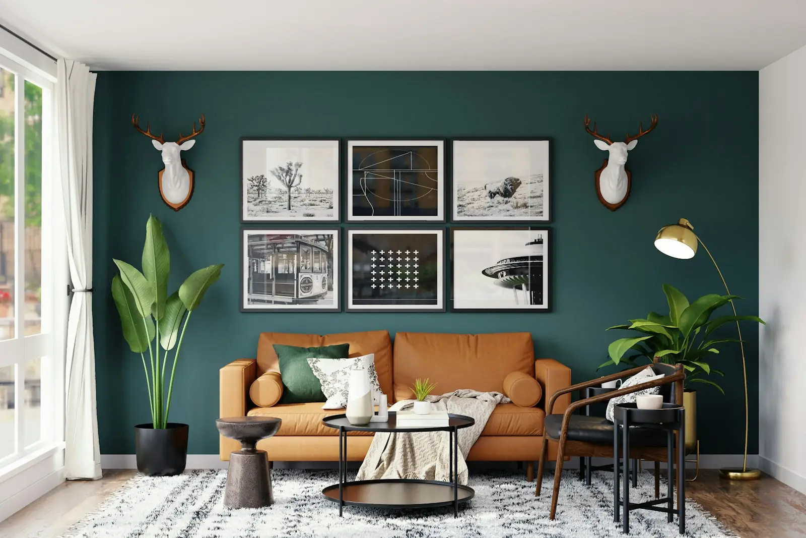
The traditional advice is to paint small rooms white to make them feel bigger. It can work, but in a small room with little light, white often just looks grey and flat. Many designers now suggest the opposite: embrace a deeper colour, and the room feels cosy and deliberate rather than gloomy.
If you'd prefer light colours, choose a warm white or soft neutral rather than a stark brilliant white, and keep the ceiling a shade lighter than the walls.
Making rooms flow together
In most homes you can see from one room into another. Colours don't need to match, but they should feel like they belong in the same house. A simple approach is to pick a palette of three or four related colours and use them in different proportions around the house – a darker shade in one room becomes an accent in the next.
Keeping the same woodwork colour throughout is another easy way to tie different rooms together.